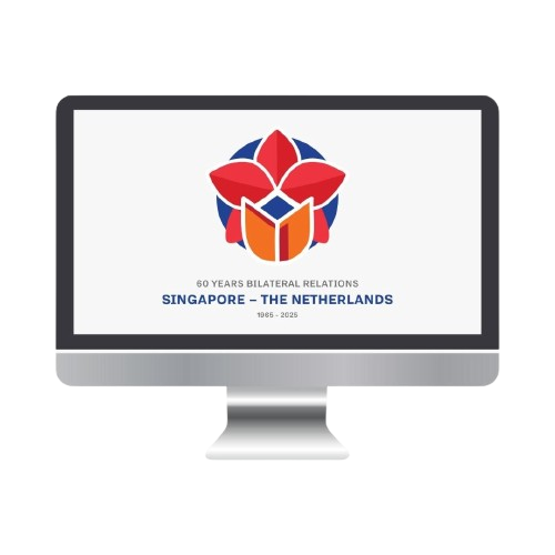
CLIENT OVERVIEW
Singapore and the Netherlands celebrate 60 years of diplomacy, marking decades of collaboration across trade, innovation, and sustainability. The Dutch Embassy needed a bold visual identity to honor this milestone.
CHALLENGE
The logo had to tell a story—blending national symbols, colors, and heritage into a modern, elegant design that captured the strength of this partnership.
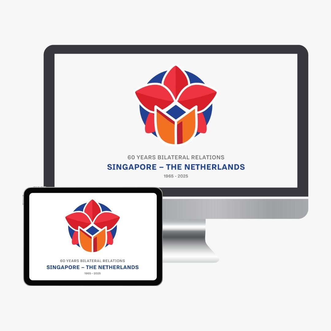
SOLUTION
• Balanced & Strong: Symmetry represents equal partnership.
• National Colors: Red, white, and blue ensure strong identity.
• Symbol of Unity: The orchid & tulip combined in a seamless design.
• Maritime Connection: The blue background reflects shared trade links.